Free Advice
Responsive Web Design
Websites must look good and work correctly, on large and small devices.
Responsive Web Design, also knows as RWD, embrasses complex methods and techniques for forcing a web-site to display in an appropriate way on destop, tablet and mobile devices - in a portrait or landscape mode (short side up or long side up).
This website is a good example of such a responsive site. If you see it on a mobile phone in portrait mode, for example, the header is minimized and the menu is designed for a touch-screen. All content in the left column, on a desktop monitor, is now given at the top and the main content is in a single narrow column, for easy readability.
For some time, now, Goaheadspace has always developed sites to be responsive to the device it is to display on. Thus, all the sites coming out of our studios will display appropriately on any device, operating system (Windows, Mac, iOS, Android etc.) or modern browser.
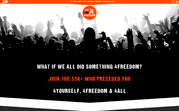
 Click the image for a larger view:
Our Latest Projects

 Show full portfolio

Client Reviews
Client Testimonial: